Mastering Tailwind CSS: From Utility-First to Beautiful Designs
A deep dive into Tailwind CSS, exploring how to leverage its utility-first approach to build complex and beautiful user interfaces efficiently.
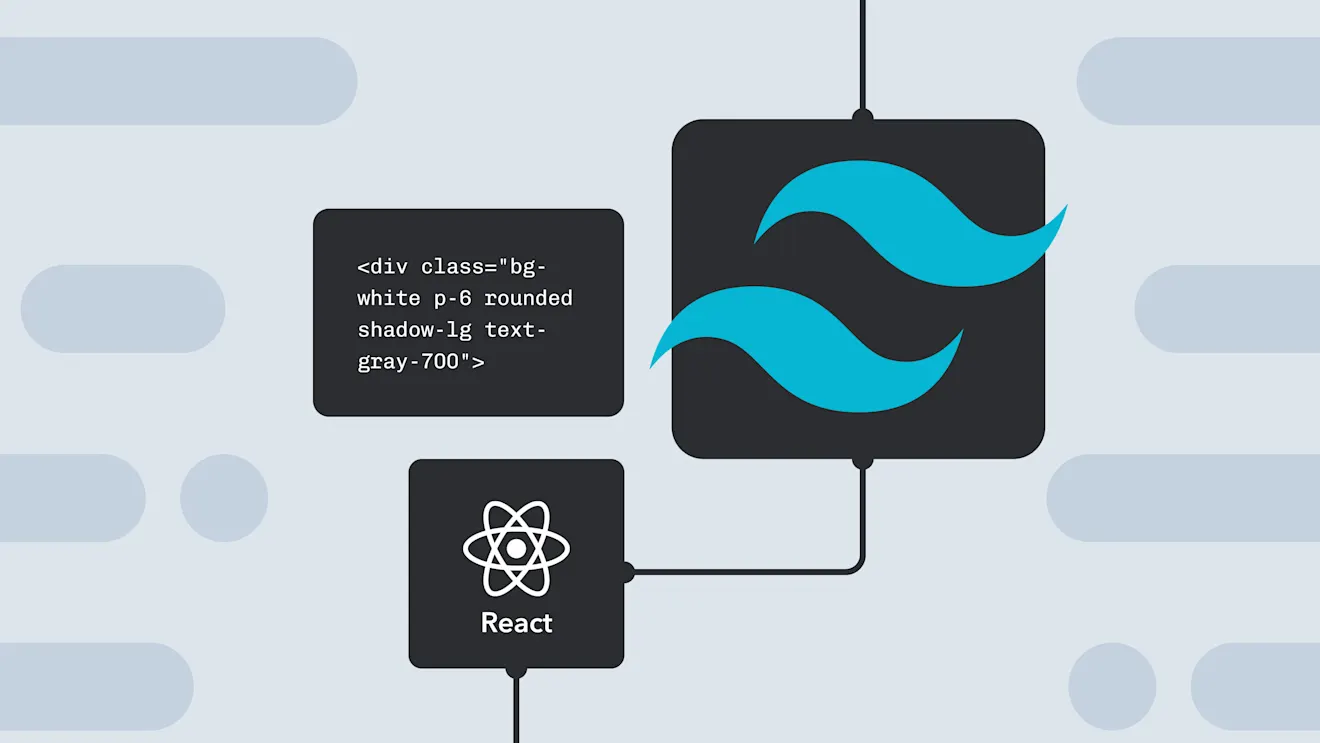
Tailwind CSS has revolutionized the way we style for the web. By providing a comprehensive set of utility classes, it allows developers to build custom designs without ever leaving their HTML. This article will guide you through the essentials of Tailwind CSS and show you how to build beautiful, responsive interfaces with ease.
What is Utility-First CSS?
Traditionally, we write CSS by creating classes that describe a component's style, like .card or .button. With a utility-first approach, we use small, single-purpose classes directly in our HTML to compose more complex designs.
For example, instead of this:
.card {
  background-color: #fff;
  border-radius: 0.5rem;
  padding: 1.5rem;
  box-shadow:
    0 4px 6px -1px rgba(0, 0, 0, 0.1),
    0 2px 4px -1px rgba(0, 0, 0, 0.06);
}
You would write this in your HTML with Tailwind:
<div class="bg-white p-6 shadow-md">
  <!-- ... -->
</div>
This approach might seem verbose at first, but it offers incredible flexibility and makes maintaining and scaling your styles much easier.
Setting Up Tailwind in a Next.js Project
Getting started with Tailwind CSS in a Next.js project is straightforward. The official Tailwind documentation provides a comprehensive guide, but here are the basic steps:
- Install Tailwind and its peer dependencies:
npm install -D tailwindcss postcss autoprefixer - Generate your configuration files:
This createsnpx tailwindcss init -ptailwind.config.jsandpostcss.config.js. - Configure your template paths in
tailwind.config.jsto tell Tailwind which files to scan for classes:module.exports = { content: [ "./app/**/*.{js,ts,jsx,tsx}", "./components/**/*.{js,ts,jsx,tsx}", ], // ... }; - Add the Tailwind directives to your global CSS file (
./app/globals.css):@tailwind base; @tailwind components; @tailwind utilities;
Core Concepts
Responsive Design
Tailwind uses mobile-first responsive prefixes like sm:, md:, and lg:. You can apply different styles at different breakpoints.
<div class="w-full md:w-1/2 lg:w-1/3">
  <!-- This div is full-width on small screens, half-width on medium screens, and one-third width on large screens -->
</div>
Hover, Focus, and Other States
You can style elements based on their state using prefixes like hover:, focus:, and active:.
<button
  class="rounded bg-blue-500 px-4 py-2 font-bold text-white hover:bg-blue-700"
>
  Save
</button>
Dark Mode
Tailwind has built-in support for dark mode. If you've configured it in tailwind.config.js (usually with darkMode: 'class'), you can use the dark: prefix.
<div class="bg-white text-neutral-900 dark:bg-neutral-800 dark:text-white">
  <p>This component supports dark mode!</p>
</div>
Customizing Your Design
One of the most powerful features of Tailwind is its customizability. You can extend the default theme, add new utilities, or even write your own plugins in tailwind.config.js.
// tailwind.config.js
module.exports = {
  theme: {
    extend: {
      colors: {
        "brand-primary": "#FF6363",
        "brand-secondary": "#1C1C1E",
      },
      fontFamily: {
        sans: ["Inter", "sans-serif"],
      },
    },
  },
  plugins: [],
};
Conclusion
Tailwind CSS empowers developers to create unique, high-quality designs without the constraints of traditional CSS frameworks. By embracing its utility-first philosophy, you can build, maintain, and scale your application's styling with unparalleled efficiency. Give it a try on your next project—you might just fall in love with it.