Mastering CSS Grid Layout
A comprehensive guide to using CSS Grid for creating complex and responsive layouts.
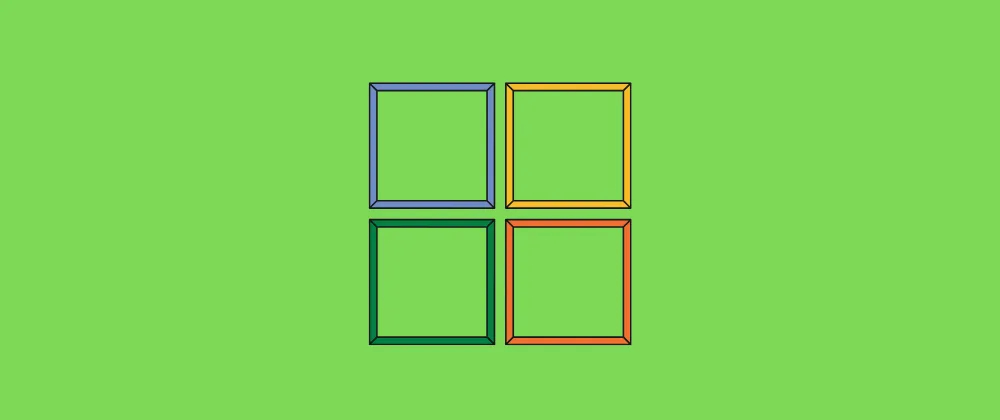
CSS Grid is a powerful layout system available in CSS. It allows you to create complex, responsive web layouts with ease.
Understanding Grid Containers and Items
A grid layout consists of a grid container and several grid items. The grid container must have its display property set to grid or inline-grid.
.container {
  display: grid;
}
All direct children of this container will automatically become grid items.
Grid Columns
You can specify how many columns you wish to create using the grid-template-columns property. The property accepts any number of values. The number of values determines the number of columns, and the value itself determines the size of that column.
.container {
  display: grid;
  grid-template-columns: 100px 200px;
}

.item {
  font-family: Georgia, "Times New Roman", Times, serif;
  font-size: x-large;
  text-align: center;
  padding: 20px;
  border: 1px solid orange;
  background-color: bisque;
}
Responsive Grids
CSS Grid makes it easy to create responsive layouts using fr units and media queries.
Conclusion
With CSS Grid, you can build layouts that were previously difficult or impossible with floats or flexbox alone.